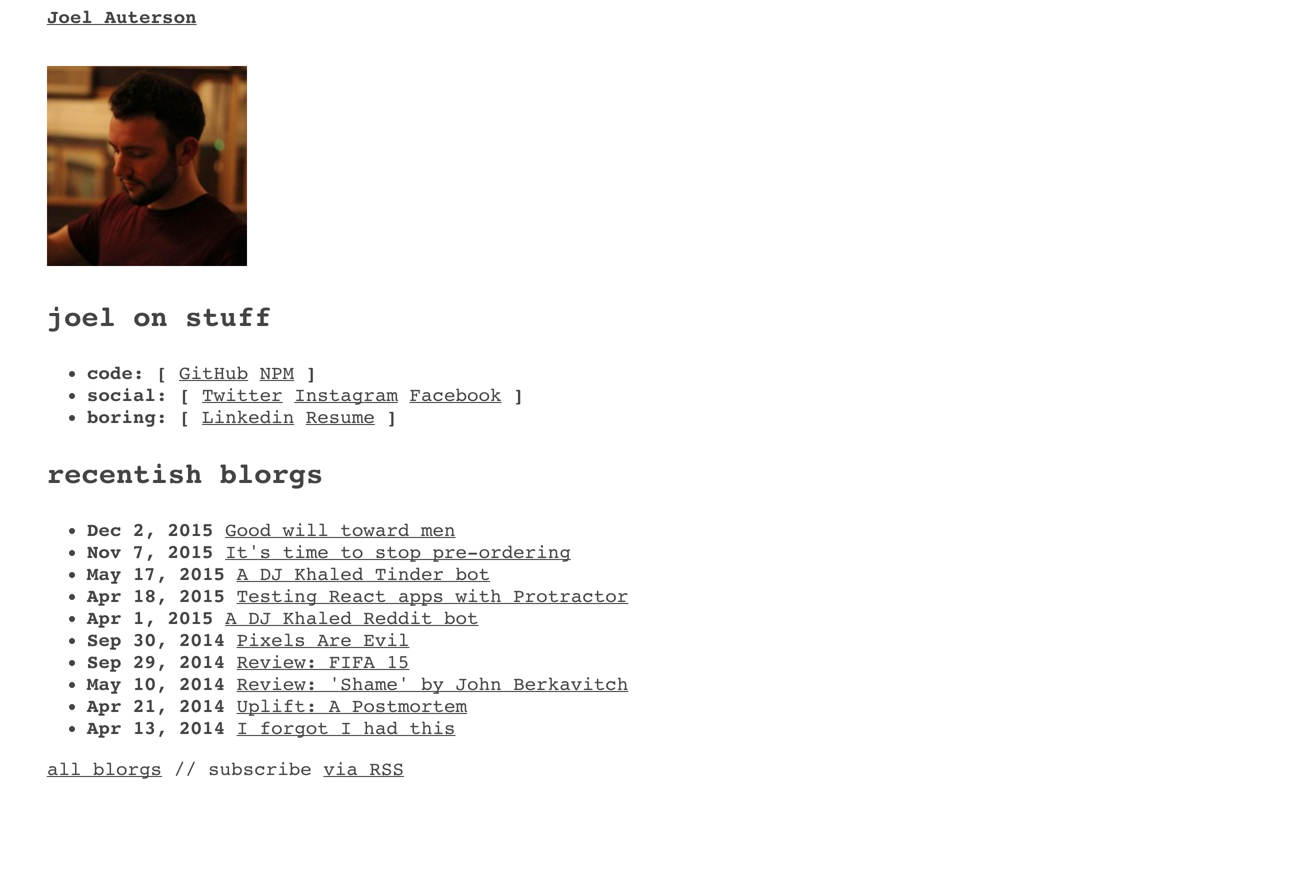
I’d got a little bit bored with the design on this website, and that boredom gave me no desire to write on it. Boo.
I was then reading about brutalist web design (it is very cool) and decided that what I wanted was the most minimal site design possible while still maintaining readability. This is it, or at least as close as a couple of hours’ work could get me.
The font is actually Courier, a monospaced font. I don’t really like Courier as a terminal font - I prefer Source Code Pro or something similar - but I think it’s actually quite nice to read on a page. You may disagree, but I don’t care because it’s my website so there.
Being super-minimalist in code samples probably would have impacted readability, so I’ve just gone the opposite way and used a theme I really like, even if it’s quite colourful.
function isJavaScriptNice() {
    console.log("Why do you even need to ask");
    return false;
}
The source code is available on GitHub, if for some reason you want to see it.
I’ll probably be making tweaks constantly over the next few days - suggestions in comments are very welcome.
For now, I’ve got a new fancy (as in, very much not fancy) home page. Go there. Go on.
P.S. Try looking at those ‘joel on stuff’ arrays on the home page on a mobile. Cool, huh? Yet another reason to use monospaced fonts absolutely everywhere. Including on birthday cards.

